How was the colour palette created?
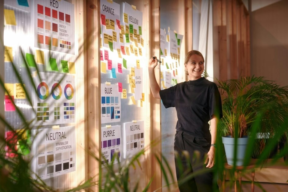
vanRaam worked with colour expert Anna ter Haar to develop the new colour palette. She started with vanRaam’s history. Colours such as ocean blue, red and orange have been strongly associated with the brand for many years. We wanted to retain that recognition.
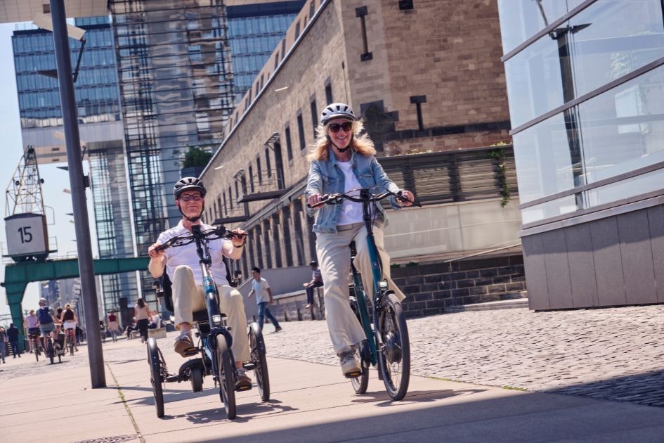
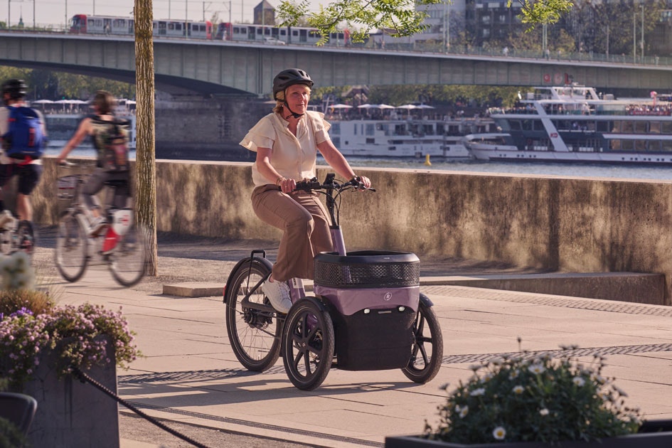
At the same time, we looked at which colours were less effective. We also considered the bikes themselves. The frame of a vanRaam bike is larger and more visible than that of a standard bike. This means colour has more influence on the bike’s appearance.
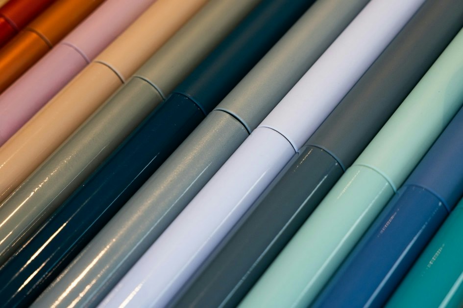
The colours therefore needed to be bold enough for the larger frame, without looking heavy or solid. The stickers and graphic elements were also reviewed. By better coordinating the colours, shapes and positions, we have created a calm and refined look. Step by step, this led to a palette that suits the bikes, vanRaam and, above all, the people who ride them.